Wednesday, 16 November 2016

Line Quality, Mark Making and Pattern

Different qualities of line using smooth, heavy, rough and light lines to create different patterns.


I wonder if these marks could be interpreted into my drawings as background patterns or to create more dimension?
I intend on trying these patterns in my drawings to give them more of a three dimensional approach. This could make my simple flat images look more professional and they could possibly be digitally enhanced using the patterns as my past digital pieces have looked flat.
What I'm going to do next is experiment with the mark making by adding them into my drawings to create light and shadow.


Sticking with the mythical creatures theme I have been continuing to develop Gary the Goblin by adding the mark making approaches.
The ink seems to be the weakest approach because of the lines being too thick to create the shadows in the drawing.
The pieces where I have used pencil have a lot more character in the drawings because of the texture created. These are my personal favourite out of the 4 drawings as the three dimensional approach looks the strongest when creating shadows.

Saturday, 12 November 2016

Judge a Book by its Cover

Brief

  • Create a book cover using a book from the library
  • Design project
  • Media, process, application 
  • What is it about?
  • What are the themes?
Concept motifs made visual through image making.
  • How do you make these things visual?
  • How do you communicate their meaning?
  • How do you design them across the cover, spine and back of a physical book?
  • How do you draw someone's attention?
Begin with an idea in mind rather than looking at a picture.

Think about the page, scale, layout, repetition and media of the design.
Experiment with type.
  • Title on the front
  • Title, author and library number on the spine

Roughs


Why are these polar bears wearing trainers?
It's because they're cool.


Using my sketchbook to begin creating character designs.
The furby pencils are my favourite medium to work in when creating quick sketches as they are simple to create tonal value to simplistic designs.
I particularly like the designs that are coloured in as I enjoy creating pieces with minimal outline.

I need to continue my character development throughout my roughs as well as using the dimensions for the book cover to work on how the layout will work.


I prefer the characters that have been coloured with minimal outlines with the 'cool' elements drawn over the top.
I need to work on drawing motorbikes.
Should I make the bikes more complex to counteract with the simplicity of the polar bear?


Creating the rough designs of the book covers has proven difficult because of the layout of the book being such a square form.
I want the front and the back of the book cover to connect in some shape of form but the compositions I have created so far seem to make it impossible to happen.

Feedback Response 


Evaluating and reflecting on my own work has helped to construct a better idea for a final piece which will mean I will use a more digital approach.
Which I dislike.
However it involves using analogue approaches as well.
This needs to be tested in my book to see if it will work as a final idea.

How many ways could I make a polar bear cool apart from sunglasses and leather jackets?

I intend on looking further into different subcultures from the past to present day that are considered 'cool'. 
From hippies to the mafia.

Final Response

I moved to the more digital approach to create the final piece. 


I am happy with the process I have chosen to create my final book cover design as using a digital approach rather than my original hand drawn roughs seems to create a more crisp edge to the piece.
I practiced the idea by printing the design and quickly drawing the cool elements although it printed at the wrong size making it too big to fit around the book.
Also the hand drawn designs on the practice book didn't all look completely up to standard when placed on the image. 
For my final piece I made sure it was set to the correct size before printing and altered some of the hand drawn 'cool' elements so that they look better on the cover when its folded.
Although the brief allowed us to use an unlimited amount of colours I decided on keeping it as minimal as possible because it would look too complex and mashed together with the photographs.
If I were to create the book cover again I would create more roughs using the dimensions of the book with the digital approach and research further into cool stereotypes.


End of Module Student Evaluation

End of Module Student Evaluation
BA(hons) Illustration
Module Code: Visual Skills OUIL403

Name: Meghan Armitage
Student ID: MA258999

Please identify where the evidence for each of the learning outcomes is within your submission and how well you feel you have met the learning outcomes. Please also grade yourself in relation to the learning outcomes using terms:
> poor, satisfactory, good, very good, excellent (Note- This is so that the team have an understanding of how well you feel you have done. It is not an indication of the actual grade you may receive)

Learning Outcome
Evidenced where?
Blog, Sketchbook, Roughs Final Illustrations, development sheets etc.  (No more than 75 words)
Your grade
Using words:
> poor, satisfactory, good, very good, excellent
4A4 
Demonstrate an awareness of practical and conceptual concerns within the context of visual investigation and visual thinking.
(Knowledge & Understanding - Research and Critical Awareness)

Conceptual concerns are clearly shown in my sketchbook where I have used different processes and thought about how my final ideas will look using different layouts which can be seen especially in the ‘Judge a Book by its Cover’ brief.
My blog shows critical awareness throughout each brief where I have analysed my own work as well as others although this is not my strongest area as I find it difficult to be critical of my own work and make it too descriptive.
Satisfactory
4B3
Explore a range of approaches to the generation and investigation of ideas in the development of solutions to set problems.
(Cognitive Skills - Problem Analysis, Problem Solving)

Throughout my sketchbook I have shown ways of generating and developing my ideas by continuously doing repetitive drawings whilst altering elements in each one until I am completely happy with the outcome.
There are also loose pieces of paper from the ‘How to’ brief where I used large sheets to create 100 ideas which I quickly sketched onto A2 paper. As well as the book cover roughs which are the exact dimensions of the book.
Very Good
4C3
Visually explore ideas through the selection of appropriate methods, processes and media in response to set briefs.
(Practical Skills - Technical Competence and Practical Development)

My practical development can be seen in my sketchbook where I have experimented with different media which best suits the designs.
As well as the A2 roughs for the ‘How to’ brief which has where I worked with different materials which proved difficult because of it being only one colour with variations.
On my first roughs I used two colours although I narrowed it down to one colour using different mediums for the final piece.
Good
4C4
Demonstrate a practical investigation of visual thinking, visual research and visual development.
(Practical Skills - Visual Quality and Conceptual Development)

My sketchbook is my best area for visual thinking as I can put ideas down quickly whereas on the blog I’d have to load the page before I could note the idea or question.
Also I have created character sheets which are seen throughout my sketchbook where I have developed my drawings using different processes and changing elements of the designs.
Good
4D3
Document and record critical awareness, evaluation and self-reflection in response to their own work and the work of others.
(Key Transferable Skills - Organisation, Communication and Evaluation)

My blog contains the most critical awareness of my own work throughout each brief as well as smaller tasks such as articulate squares.
I have worked through each brief on my blog in a chronological order although I could improve my blog by being more aware of my own work so I could analyse the best areas and areas for improvement.
Being critical of others work is a lot easier for me as I have strong opinions and can ask questions about their work.
Areas of my sketchbook also include critical awareness where I have asked questions about my own drawings.
Satisfactory

Evaluation (See guidance below for more information)
You are required to write a 500 word evaluation of this module.

The beginning of visual skills started with a slight bit of confusion because of it being the start of the course and I was still getting back into creating work with set briefs. I enjoyed the ‘How to’ brief as I my strongest ability as an illustrator is creating multiple quick drawings of the same object/element with slight alterations until I am completely satisfied with them. As the module progressed I became more confident with the briefs as I knew the best way to work is to create as many roughs as possible and spill all of my ideas onto the pages of my sketchbook.
I have further developed my digital skills although they could still be improved which I will continue to work on. Also I have gained a strong relationship with furby pencils because of the texture they create in drawings as well as being able to change the pressure of them to add more or less texture. I like using them because they make drawing simple characters fast and easy which emphasizes the wonkiness of my drawings.
My How To final response has been my strongest piece of work so far. The use of colour was the strongest point of the design as a whole especially with the orange ink taking over the thinner orange lines on the page. For each brief I have used a humorous/satirical approach which has further developed throughout the module.
My visual skills outcomes could have been stronger if I had made better use of the studio after sessions to complete my work and possibly complete a blog post when the problems I have had throughout the day are fresh in my mind. However, I believe the progress of developing my ideas before the final responses for each brief have been strong and gotten stronger throughout each brief as I have more developed roughs from the ‘Judge a Book by its Cover’ brief compared to the ‘How to’ brief.
At the beginning of the module I struggled with the blog as I always included too much description of the processes of my work rather than asking questions and being critical of myself. However, I believe this improved throughout the module as I realsied I need to be more reflective of my work. I overcame this problem by doing a blog post as soon as I got home after each session rather than getting caught up in having to write them and speaking retrospectively.
In the future I will stay behind after sessions so I can get more work completed rather than going home and becoming distracted. I believe I will get a lot more work completed even if I stay behind an hour after each day to finish a task so I don’t end up drowning in my work which happened slightly in this module although I began creating lists and used studio development days to catch up on work.
My opinions of illustration changed throughout the module as I would have never have thought of using one colour to create a piece of work as I believed it wouldn’t work although the ‘How to’ brief proved me wrong. Also the use of crit sessions and tutor feedback has been a massive help throughout the module to help me further experiment with different ideas and push myself to use methods that aren’t my strongest points.

Evaluation Guidance
This should be a reflective summary of your experience across the module

-       How did it go? Where did your journey start, where did it end?
I knew very little at the start of this module. At the end of the module I feel that…

-       What learning took place? What was useful to you?
Be specific. New skills? New methods? New processes or approaches? Did you use the blog to reflect on your project development?

-       What went well and why? What did you enjoy? What were you happy with as an outcome?
Be critical and analytical. Why did you enjoy it? Perhaps identify particular sessions?
This could be ideas, solutions to problems, studentship or research. How well did you use the studio? Did you invest enough time in the development and testing of your outcomes?

-       What could you have done better?
What were the problems you faced? What did you do to try to overcome them? This could be in reference to studentship, organization, blogging as much as studio practice.

-       How can you apply what you have learnt here for future modules and projects?
Application and future thinking. Things you would do differently next time? What useful methods, processes and ideas will you take forward into the next module?

You may also want to consider:

Self-questioning: How did your thoughts and opinions change as you progressed through the module?

Feedback: What other people (tutors and peers) thought of work and how you responded to that feedback?


Research: Did you use contextual research to inform your ideas, ways of thinking or understanding of the challenges set. This may include further research of your subject matter, slides from the presentations or use of the library.

Thursday, 3 November 2016

Illumination Editorial Pieces

Brief Summary 

Exploring editorial illustration which is seen in newspaper articles, magazines and publications. 

Produce 3 different illustrations that visually communicate your response to a given text. 

2 colours 
3 dimensions 

200x200mm
105x200mm
290x105mm

Need to be distinct in their content 
Broad range of possible visual composition
Allowed to use digital approach

Personal opinions, individual response and creative interpretations.
Simple and to the point.

What tone of voice?
How is it appropriate to theme?
  • Humorous
  • Factual
  • Satirical 
  • Statistical 
  • Abstract 
How are you going to tell the story?

Roughs 


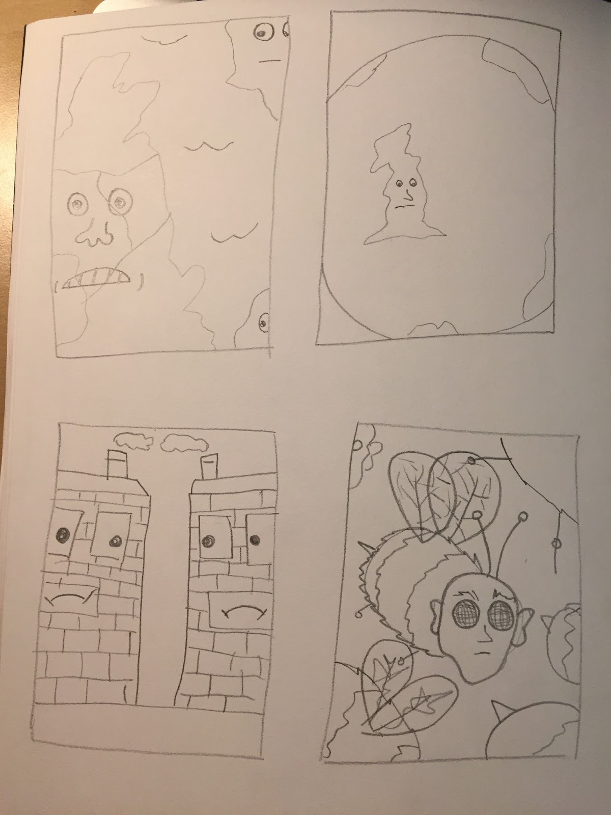
My sketchbook is being constantly filled with roughs as I continue to think of more possible ideas to use for my final 3 pieces.
Some ideas appear to be stronger than others such as the boxing dog although why is the ring leader a human?
This could possibly be redrawn to change the human to another dog or possibly two dogs boxing over a dustbin.

My least strong idea is for the 105x200mm dimension piece. 
This is because the drawings appear to be the weakest as well as the ideas as a whole.
How could I alter this?

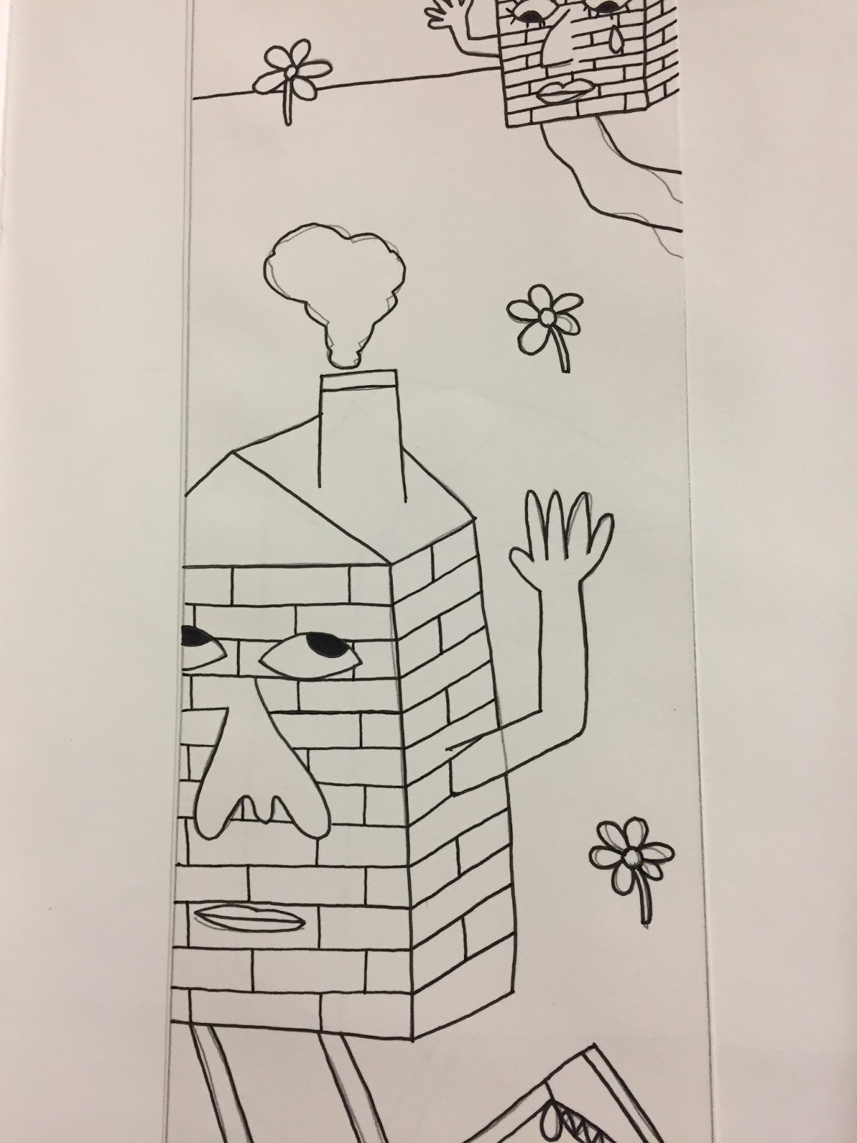
My 290x105mm has multiple ideas which I intend on redrawing over and over and adding colour to help me select the best idea.
So far I belive its the house piece although I could further alter this to make the houses look more distant and upset with one another.
Maybe add a more three dimensional approach?


Do the drawings look better with thick or thin outlines?
I enjoy the messy approach to the thicker lines but will it make it more difficult when it comes to drawing out the final pieces to be scanned in?


I am struggling to choose the best colours that will work well with all 3 of the images.
I have tested parts of each drawing in different colours to help my decision.
Do I want the outlines to be a colour or just black?
Do I even want them to have outlines or just solid blocks of colour?


Digital


I finally chose the colours when creating the piece digitally as I continued development.
I like the use of the colours throughout each of the three editorial pieces although the pink tones could have been altered further to possibly make them slightly paler.
I have been undecided on whether to include the black outline because I tend to prefer no outline although the image seems to be pretty bare and flat without it.
I have decided to keep the outline although I am still unsure on if it would look better if I further altered the outline to another colour to fit with the 2 colours scheme.

Would it look better if I altered the colours to make more contrast between so the outline is not needed?

If I were to complete the illumination brief again I would use more simplistic shapes with no or minimal outline using a digital approach.

I need to continue practicing with digital development because it seems to not work well with my designs. I could scan in textures to make the pieces less flat which could be tried on some of my development pieces.