Wednesday 23 November 2016

Self Portrait

Brief 

  • Make a collage portrait of yourself using shape and texture.
  • Head and shoulders (not the shampoo)
  • Use ink, acrylic, pens, pencil and other mark making materials

Outcome


I enjoyed creating the textures using separate pieces of paper and cutting them into shapes to produce the final outcome.
However, I wish I had used another colour along with green to create the response to make it suit my personality more.
Pink and blue could have possibly gone quite well as those are my current hair colours which I am most recognised for.
If I was to make this piece again I would use more variations of mark making for my skin tone as well as hair.
Could the piece be improved by having a more simplistic approach making it look less like the real me?


Tuesday 22 November 2016

One Week Map

Brief 

  • Create a two colour screen printed map.
  • Working collaboratively with groups of 4/5.
  • Make drawings of journey and any discovery.
This brief is reportage illustration which involves documenting something in an illustrative way, similar to observational drawing.

Psychogeography is exploring spaces (especially cities) using senses which you wouldn't normally notice by following a way that hasn't been pre laid out.

Exploring Leeds

At first being in a group of people you don't know particularly well seemed a little nerve wracking. Although, we soon began to learn more about each other and create strong research.
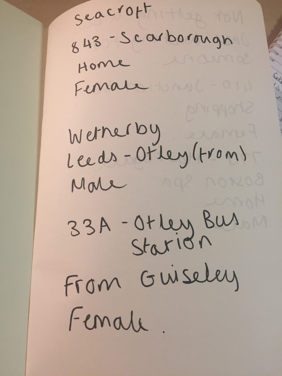
We headed for the bus station which involved having to ask 10 people what bus they were getting and where they were going.

The results weren't amazing.


If I did this again I would get to know the person a lot more by asking more questions.
Would it have helped to get a photograph or drawn the person?

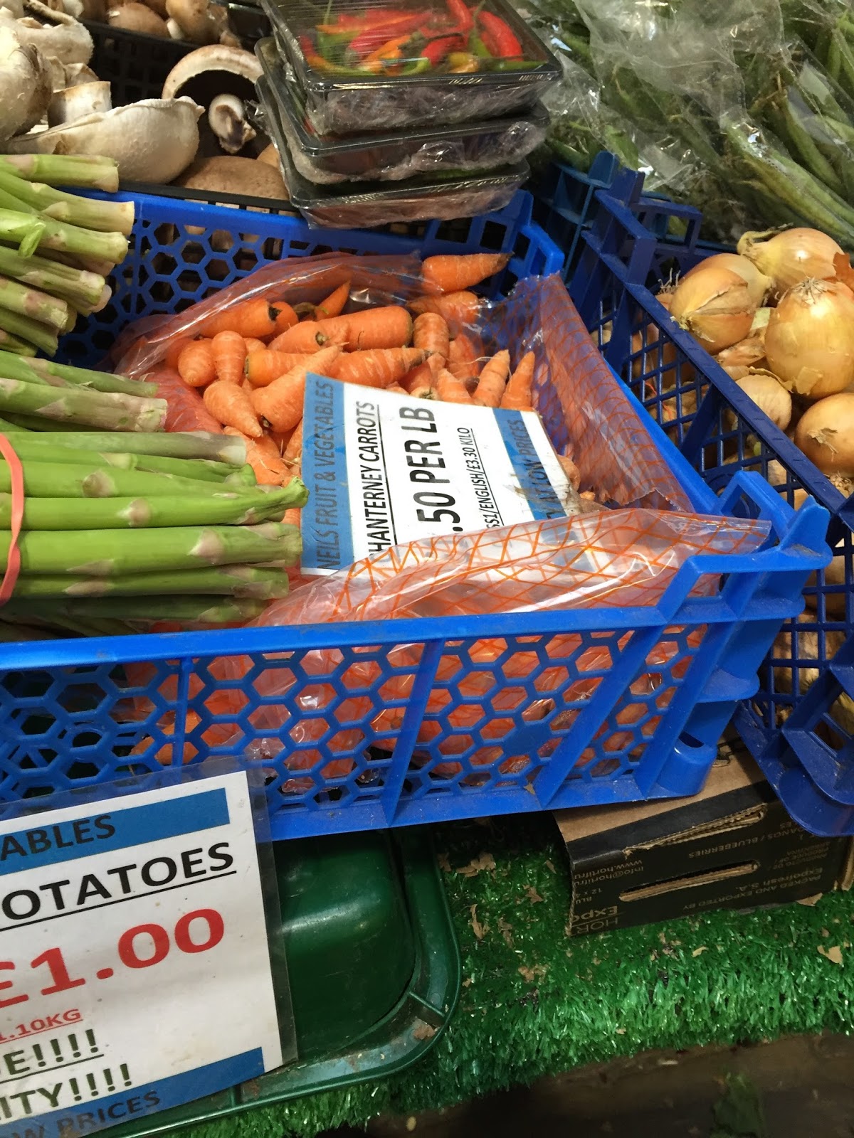
The market was the strongest point for the whole of the research in my opinion as we chose one colour to take photos of throughout our journey which produced a lot of photographs as research that we could possibly work with.


Choosing this colour allowed us to work as a team in an individual manner as we all took our own photographs as others noticed parts that some people may not have.

We have forgotten to record the route we took of the market as well as the route we took to get to the bus station which could potentially weaken our research when it comes to creating outcomes for the map.

The weather made it difficult to make rubbings of surfaces which could potentially be used as part of the screen print map.

We headed to the Corn Exchange to warm up which turned out to be a great place for people watching and drawing. 


I created some drawings whilst in the Corn Exchange of the people hanging about there whether they were people who work there or just visitors. 
Everyone seems to move fast.
I particular enjoyed drawing the man with long hair and glasses as I watched him walk a small distance around the Corn Exchange and guessed he worked at the barbers.

I wanted to go to a wig or glasses shop and take photographs of us wearing the items but nobody else in the group wanted to because of the horrible rain. Although this could have extended our research.

If I were to repeat this day again I would change the weather and look further into the sounds and smells of different areas that we visited or possibly visit another part of Leeds that I've never been to before.

Roughs 

We have had a discussion of our different ideas and began putting them together to work towards the final screen print.

Only being given 2 pieces of acetate to create the final response means its essential to create a lot of roughs and work as a team to produce a successful piece.


As a group we had a lot of strong ideas but seemed to struggle most with the idea of being limited to two colour as adding text into the piece to mimic the sounds of the market.
With inspiration from the artist Cupco we allowed our hand written text to overlap.

So far I have enjoyed working as a team as I am feeling a lot more productive and inspired by the other group members ideas and research. 


Photocopying the initial first layer of the screen print has allowed us to continue expanding our ideas on how the next layer should be produced.
We have been deciding whether to use solid colour or mark making to create the objects to go over the top of the diagram.

Would it look to crowded and confusing if we used mark making to produce the objects over the top of the text?
Would the objects disappear into the background?

We have decided to settle with solid colour using paper cuts to create the final layer which needs to be stuck onto the acetate and lined up with the map.

The first colour still needs to be decided on although we can't seem to decide which shade of blue we should use between us.

Would a darker shade of blue be too overpowering for the orange when it is screen printed on top of it?


Our first layer is down and ready for action.
Tomorrow the second layer needs to be added and aligned ready for printing tomorrow evening.


Final Outcomes


As  a group we split up to take on both layers of the screen print. We had the freedom to experiment with different methods of printing that I had personally never heard about before which made the whole session interesting to me as I tend to enjoy the processes. 
This allowed us to create multiple outcomes giving us an option of which to choose for our final response.

I enjoyed the session as a whole as I got to try different printing methods that I had never used myself before. However, we could have created more pieces of both layers combined so we had more final outcomes to work with as a group but we all seemed pretty distracted in trying to make our own layers.


This is the best final outcome because of the blue tone that has been used for the background layer doesn't overpower the orange tone which is the main part of the whole image.
I enjoyed create the screen prints and I am happy with the final outcomes that we created as a group.


Wednesday 16 November 2016

Shape and Texture

Brief

  • Create 5 drawings of your favourite fruit using A5 paper using only one colour and black whilst concentrating on shape and texture to give the piece character.
  • Consider simplification, reduction and minimal approach.
  • Think about different shapes, edges and viewpoints of the fruit when creating the drawings.

Roughs


Looking into images of a pear on google I began to look at the different viewpoints and colours of pears. Including when they're cut in half to capture the seeds in the centre.
Perhaps I could add more than one colour to the pears for the cut in half pieces to show the skin around the edges as well as the internal part.
Would this make the design look more pear like?
Next I will begin to create the A4 sized pear drawings making them as simplistic as possible.

Final Five


In these 2 designs I have considered the use of analogue mediums and how a more textured approach can be created when using them although when thinking of shape I want to keep the pieces as minimal as possible.
For the next pieces I intend to concentrate on craft more to make the drawings more flat by using different materials.


I enjoy the piece with the pear cut in half as it slightly breaks the rules of using one colour and black but also the tissue paper has formed its own texture when I have glued it onto the paper.
Could this piece possibly be improved by adding a third colour to create the thin skin of the pear?
Or possibly create the outline of the skin and adding the seeds and stem onto the white background?
If I did this task again I would research further into different view points of a pear and try capture its character still using a crafting method and thinking further into the production of the piece by creating more roughs before the final designs.


Line Quality, Mark Making and Pattern

Different qualities of line using smooth, heavy, rough and light lines to create different patterns.


I wonder if these marks could be interpreted into my drawings as background patterns or to create more dimension?
I intend on trying these patterns in my drawings to give them more of a three dimensional approach. This could make my simple flat images look more professional and they could possibly be digitally enhanced using the patterns as my past digital pieces have looked flat.
What I'm going to do next is experiment with the mark making by adding them into my drawings to create light and shadow.


Sticking with the mythical creatures theme I have been continuing to develop Gary the Goblin by adding the mark making approaches.
The ink seems to be the weakest approach because of the lines being too thick to create the shadows in the drawing.
The pieces where I have used pencil have a lot more character in the drawings because of the texture created. These are my personal favourite out of the 4 drawings as the three dimensional approach looks the strongest when creating shadows.

Saturday 12 November 2016

Judge a Book by its Cover

Brief

  • Create a book cover using a book from the library
  • Design project
  • Media, process, application 
  • What is it about?
  • What are the themes?
Concept motifs made visual through image making.
  • How do you make these things visual?
  • How do you communicate their meaning?
  • How do you design them across the cover, spine and back of a physical book?
  • How do you draw someone's attention?
Begin with an idea in mind rather than looking at a picture.

Think about the page, scale, layout, repetition and media of the design.
Experiment with type.
  • Title on the front
  • Title, author and library number on the spine

Roughs


Why are these polar bears wearing trainers?
It's because they're cool.


Using my sketchbook to begin creating character designs.
The furby pencils are my favourite medium to work in when creating quick sketches as they are simple to create tonal value to simplistic designs.
I particularly like the designs that are coloured in as I enjoy creating pieces with minimal outline.

I need to continue my character development throughout my roughs as well as using the dimensions for the book cover to work on how the layout will work.


I prefer the characters that have been coloured with minimal outlines with the 'cool' elements drawn over the top.
I need to work on drawing motorbikes.
Should I make the bikes more complex to counteract with the simplicity of the polar bear?


Creating the rough designs of the book covers has proven difficult because of the layout of the book being such a square form.
I want the front and the back of the book cover to connect in some shape of form but the compositions I have created so far seem to make it impossible to happen.

Feedback Response 


Evaluating and reflecting on my own work has helped to construct a better idea for a final piece which will mean I will use a more digital approach.
Which I dislike.
However it involves using analogue approaches as well.
This needs to be tested in my book to see if it will work as a final idea.

How many ways could I make a polar bear cool apart from sunglasses and leather jackets?

I intend on looking further into different subcultures from the past to present day that are considered 'cool'. 
From hippies to the mafia.

Final Response

I moved to the more digital approach to create the final piece. 


I am happy with the process I have chosen to create my final book cover design as using a digital approach rather than my original hand drawn roughs seems to create a more crisp edge to the piece.
I practiced the idea by printing the design and quickly drawing the cool elements although it printed at the wrong size making it too big to fit around the book.
Also the hand drawn designs on the practice book didn't all look completely up to standard when placed on the image. 
For my final piece I made sure it was set to the correct size before printing and altered some of the hand drawn 'cool' elements so that they look better on the cover when its folded.
Although the brief allowed us to use an unlimited amount of colours I decided on keeping it as minimal as possible because it would look too complex and mashed together with the photographs.
If I were to create the book cover again I would create more roughs using the dimensions of the book with the digital approach and research further into cool stereotypes.