Brief Summary
Exploring editorial illustration which is seen in newspaper articles, magazines and publications.
Produce 3 different illustrations that visually communicate your response to a given text.
2 colours
3 dimensions
200x200mm
105x200mm
290x105mm
Need to be distinct in their content
Broad range of possible visual composition
Allowed to use digital approach
Personal opinions, individual response and creative interpretations.
Simple and to the point.
What tone of voice?
How is it appropriate to theme?
- Humorous
- Factual
- Satirical
- Statistical
- Abstract
How are you going to tell the story?
Roughs
My sketchbook is being constantly filled with roughs as I continue to think of more possible ideas to use for my final 3 pieces.
Some ideas appear to be stronger than others such as the boxing dog although why is the ring leader a human?
This could possibly be redrawn to change the human to another dog or possibly two dogs boxing over a dustbin.
My least strong idea is for the 105x200mm dimension piece.
This is because the drawings appear to be the weakest as well as the ideas as a whole.
How could I alter this?
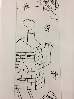
My 290x105mm has multiple ideas which I intend on redrawing over and over and adding colour to help me select the best idea.
So far I belive its the house piece although I could further alter this to make the houses look more distant and upset with one another.
Maybe add a more three dimensional approach?
Do the drawings look better with thick or thin outlines?
I enjoy the messy approach to the thicker lines but will it make it more difficult when it comes to drawing out the final pieces to be scanned in?
I am struggling to choose the best colours that will work well with all 3 of the images.
I have tested parts of each drawing in different colours to help my decision.
Do I want the outlines to be a colour or just black?
Do I even want them to have outlines or just solid blocks of colour?
Digital
I finally chose the colours when creating the piece digitally as I continued development.
I like the use of the colours throughout each of the three editorial pieces although the pink tones could have been altered further to possibly make them slightly paler.
I have been undecided on whether to include the black outline because I tend to prefer no outline although the image seems to be pretty bare and flat without it.
I have decided to keep the outline although I am still unsure on if it would look better if I further altered the outline to another colour to fit with the 2 colours scheme.
Would it look better if I altered the colours to make more contrast between so the outline is not needed?
If I were to complete the illumination brief again I would use more simplistic shapes with no or minimal outline using a digital approach.
I need to continue practicing with digital development because it seems to not work well with my designs. I could scan in textures to make the pieces less flat which could be tried on some of my development pieces.


No comments:
Post a Comment