Wednesday 26 October 2016

Line

Seven Primary Functions of Line

  1. To create its on intrinsic beauty.
  2. To divide or limit an area or space.
  3. To delineate a thought or symbol.
  4. To define form by edge or contour.
  5. To catch and direct the eye over a given course.
  6. To produce a grey or tonal gradation.
  7. To create design or arrangement. 
    - Andrew Loomis, 1947


Brief Summary

Creating a quick dictionary of lines to produce different qualities by making lines, circles, squares and zigzags using different mediums and techniques. Once the dictionary is completed begin to create portraits of others interpreting the same line qualities.


The smooth looking circles created using a singular brush stroke are my personal favourite as they will be the most useful when creating portraits.


The thick/mid sized lines seem to be most appealing to me when I think of creating the portraits. I will try to challenge myself by creating my motifs using thinner lines which tends to involve having to make the image more complex.

How shall I simplify the characters using a thin line on A3 sized paper?

Portraits


I need to work on side angles drastically. 
This one proved more difficult because she had her head down and to the side making it difficult to paint.


As I said about the smooth circle piece I again enjoyed creating a portrait using the same line quality. It makes the image look flat without the need of shading which may make it too complex. 
I love that you cannot see where the lines begin and end on the outlines of the portrait making a smooth flow to the work.

30 Drawings Motifs

For my 30 A3 drawings using the different line qualities I intend on continuing the theme of mythical creatures to further develop my character (Greg) and possibly draw some different ones. 

I am going to challenge myself by using thin line qualities which tend to involve creating more detailed outcomes. As well as using extremely thick messy lines that will involve no detail what so ever that would be easier to create on an even larger piece of paper.


Using different line qualities has taught me where details are needed and where they are irrelevant.

Thicker and more fast lines need less detail or the image will become unrecognisable. Whereas smaller lines allow more space to add more details.


 I have learnt how different an image can look when the line quality is altered which I didn't consider before doing this practice.

Some designs were a lot more challenging than others because of different pressures, thickness and textures of the lines I used.


 Considering the tool being used to create the piece and how much ink it picks up can make the drawing/painting a lot more challenging because of the ink running and how much space the line will take up on the page.

What I tried to achieve with the lines was to suit my visual subject of mythical creatures ( focusing on goblins) making them more rough and textured to suit the tone of voice.


I want to further explore line quality and how I can add more detail such as shading to an image without making it look too complex or crowded.


Articulate Squares

Space

Given a word to keep secret and draw out as many possible outcomes related to that word in small gridded squares. My word 'space' turned out to be pretty simple to create a large number of outcomes. Then people look at them unaware of the word and think of what it could be.


I didn't like the use of the pen that I began with as it made the line quality too wobbly and unclear what the drawing was.

It has been a challenge to draw in such a small frame with ideas that can be made more complex although it became easier as I continued to draw the small space related objects.

I tried to think of different outcomes that were more related to personal space rather than the universe but it proved difficult to make the response in the small area.


Mythical Creatures

Brief Summary 

Fill a minimum of 6 sketchbook pages with chosen subject theme in which I chose mythical creatures.
I have used the library to collect imagery to look further into the idea of mythical creatures. I have chosen to look at some small goblin creature in the book Wizards and Witches.


Sketchbook Pages

The first initial drawings of the goblin seemed a little too detailed for my liking as I look at the image in the book to create the drawings. 


I think after the first sketchbook page I will close the original book and continue drawing just using the reference of my own drawings with a more simplistic approach. 


Closing the book appeared to be a brilliant idea as my character kept further developing into my own creation which I gradually improved with repetitive drawing. 

He somehow developed a bald head which I prefer to the initial drawings that I created. 

Working on his different features such as the nose and the body of the goblin has helped me to be able to perfectly draw the character in pencil.

Next I intend on trying a more wet medium such as ink with fast paced brush strokes to make the character look wonky and possibly add some shading.


I loved using ink because it emphasises the messy approach which suits the character a lot more than the use of a think pencil. 
The shading didn't go so well with the look of the goblin because it makes him look a lot less ragged.
Maybe I could improve this by creating a bumpy texture to his skin with small circular shading on his skin??


My final sketchbook page resulted in the goblin man having a little dance. 

I like seeing the progress of the sketchbook pages and the development of the character.

Should he have a name to make it more personal?

I think I'll name him Greg 

I intend on continuing to develop Greg and possibly create other goblin characters using different mediums to expand my skills on using different mediums. Including Photoshop which I am the least confident with.

Typology Poster

Brief


Typology - variation on a theme (British trees etc)


Working towards a poster that explains 'How to...' do something in 24 ways using only analog media and optional labelled ideas on the final design on A2 sized paper.


100 Ideas Bang


Generate at least 100 ideas that can be narrowed down to 24 for the final piece.

Fairly easy start off with basic ideas such as using a dryer or hanging them out. However, coming up with new ideas is proving difficult and I'm struggling to get to 100.

Asking people seems to help as well as sticking a note up on the door of my flat where people can write their own ideas that I could use.

I have worked out that taking one idea and expanding on it helps to develop more ideas faster such as fire which can be made quickly with ink.


Although the final pice will need to be altered to make it monochrome which may cause issues because the fire may blend into the objects.


Final Ideas


Working out the layout for my piece has proven difficult because others seem to have amazing ideas for their layouts due to their given 'How To' but the theme I have chosen has limited me with ideas.

I am planning on sticking with the 6x4 grid method to make sure everything fits into place.


Using my sketchbook has allowed me to try out different mediums to make sure the orange ink stands out against the orange objects.

I have experimented with multiple different mediums but have been struggling to find the right tone and line quality. 

For the final design I settled with the dark orange pencil because I prefer the quality and roughness in the line of the object with the orange ink layered over it.


I enjoy my final design because it is well laid out which stops the orange fire from becoming confusing.

If I were to make this poster again I would possibly choose a more satirical approach towards the theme and stick to one medium that could make a more three dimensional approach to the work. 


Monday 24 October 2016

Photoshop Task

Brief Summary

Scan in observational and reference drawings from previous weeks and create 5 outcomes with different Photoshop treatments.

A simple task that took no more than 5/10 minutes to create each outcome to learn and practice the basics of Photoshop with quick edits to alter the image.

Using the same image throughout made it more of a challenge to come up with new ways to alter the image using basic skills.

The images could be further edited using more complex Photoshop skills which I will develop over the course.


Outcomes


First treatment on the image involved altering the brightness/contrast and levels. 
Not the most interesting piece because of the limited alterations.
Could be improved with the use of more layers to add more definition.


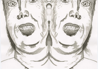
Again another slightly altered piece which has been copied and flipped to create a mirror effect.
Slightly more challenging than the first outcome because of trying to match the central area together.


Both outcomes with similar properties.
The second image is my personal favourite because of the contrast between the black and white tones.
First piece could have also been altered using analog methods with different coloured ink meaning it doesn't look strong when it has been digitally edited.


Out of all the outcomes this is my personal favourite piece. 
This is because of the level of contrast making the blacks come apart from the white background.
Only using one method of alteration has created my strongest outcome proving that minimalistic approaches can create the best images. 

Wednesday 5 October 2016

Plant Drawing


My first plant drawing became too complex as the positioning of the leaves became confusing. I improved the next drawing by using a thicker brush to simplify the image although it became too simple meaning I had to find the correct balance between the two.


I enjoyed drawing the new plant because it had a lot more interesting features that I could simplify or make more complex. The second painting could be improved by layering the ink to make it slightly more complex by adding light and shade.


Peer Crit 


When looking at other peer's work the pieces that stood out to me where the pieces that have been created with a thicker brush and fast strokes because I believe it suits the plant theme a lot better because of the amount of leaves/pollen etc can become too confusing when trying to make it complex.


This is my personal favourite piece of peer work because of the person has clearly understood the way that the ink works and the flow it has when using a thicker brush to create gestural strokes with minimal added detail.


Reference Drawing

Random Woman Drawing 


Drawing from reference has further developed my skills as I had to use my memory in order to create the work which gradually improved when I looked at the original image again and made a new painting.


As I progressed through the image making I began to notice more detail in the original image which I translated into my painting.


When the image was put in front of me to work with it became a lot easier to add more shade and light areas using the ink which improved the painting drastically. I accidently started painting the image with zoomed in proportions which I continued throughout the rest of the piece which allowed me to add a lot more detail.


Observational Drawing


Going out on location has made my relationship with drawing a lot stronger as observational drawing allows me to see my surroundings rather than being trapped in a camera frame. 

Using different mediums to create different drawings has taught me how the materials work against each other as well as individual.

To improve my observational drawings I would zoom in/out more on certain interesting points of the drawing as trying to draw multiple trees using a thin border pen takes up too much time. Also repeating the same drawing until it is completely up to standard would help me progress and develop a good relationship with observational drawing.